Web design & Internet tutorials
Search the site...
Home» Tutorials » Responsive

7 Signs You Need a Redesign

Posted by Janine Warner - September 24, 2013 - Content Strategy, Feature-Front, Mobile Web Design, Responsive, Tutorials, Web Design
Mobile Web Design

If you answer yes to 3 or more of these points, it’s definitely time to redesign your website or blog.

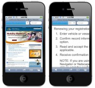
1. The growing mobile web audience has led to new approaches in web design. Today the best sites use a technique called Responsive Design to adjust the size and positioning of page elements to best fit small and large screen sizes. If you can’t read the text on your website when you view it on a mobile phone, or worse, you can’t even see it on a mobile phone, it’s definitely time to join the modern mobile world.

Read More change how a wordpress blog looks, content strategy, customize blog appearance, edit wordpress blog, mobile web design, redesign, responsive, web design
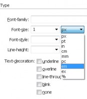
Should I use pixel, pica, em or rem to set the size when I create styles with CSS?

Posted by Janine Warner - September 23, 2013 - CSS, CSS, Dreamweaver, Dreamweaver CS5, Dreamweaver CS6, FAQ, Responsive, Tutorials
Sizes for CSS Styles

When you create CSS Styles, you can specify sizes for fonts and other elements in so many ways that confusion (and frustration) can set in pretty quickly. Historically, most of us used pixels or ems as the sizes of choice (see explanations below), but today an increasingly popular choice is rem, a seemingly magical option […]

Read More

Customizing WordPress Designs with Themes and Frameworks

Posted by Janine Warner - April 21, 2013 - Responsive, templates, Tutorials, WordPress, WordPress

WordPress is remarkably simple to use when it comes to adding posts and pages, but things can get tricky quickly when you want to customize the design or create complex page layouts. You can create custom WordPress designs in at least three ways: 1. Learn HTML, CSS, and at least a little PHP, and you […]

Read More change how a wordpress blog looks, css, customize blog appearance, edit wordpress blog, responsive, templates, web design, website, wordpress

How to create a responsive web design that adjusts to different screen sizes

Posted by Janine Warner - April 11, 2013 - Dreamweaver CS6, Feature-Front, Mobile Web Design, Responsive, Tutorials, Web Design, WordPress

Many web designers are calling 2013 The Year of Responsive Design. Responsive web design is increasingly popular because the biggest challenge of web design today is that your pages are as likely to be projected on a giant computer monitor as on a tiny cell phone screen. With responsive design, you create one web page […]

Read More mobile web design, responsive

Designing for Multiple Screens: Responsive vs Adaptive (View Janine’s PowerPoint Presentation on Slideshare)

Posted by Janine Warner - February 4, 2013 - Mobile Web Design, Responsive, Tutorials, Web Design

This is a short presentation on trends in web and mobile design, including a comparison of Adaptive and Responsive design strategies. Subscribe to Janine Warner’s SlideShare Account Learn More about Responsive and Adaptive Design in these articles Creating Responsive Web Designs How to create responsive web designs with the new Fluid Grid Layouts in Adobe Dreamweaver […]

Read More

Responsive Web Design & Testing Tools

Posted by Janine Warner - January 28, 2013 - Mobile Web Design, Responsive, Tutorials

Responsive Web Design is the hot new thing on the web, but it’s also one of the most complex strategies yet when it comes to creating a website. This tutorial is designed to point you in the direction of some of the best tools for designing and testing responsive websites. You can learn more about […]

Read More

Great Examples of Responsive Web Design

Posted by Janine Warner - September 15, 2012 - Dreamweaver CS6, Mobile Web Design, Responsive, Tutorials, WordPress

If you’re looking for evidence of the growing popularity of responsive web design, just Google the phrase: “responsive web design examples,” and you’ll find numerous collections of design examples. Here are a few responsive designs to give you a flavor for what responsive design is all about. FoodSense.is BostonGlobe.com Anderson Wise Architects Antonio Gaudi example […]

Read More dwcs6, mobile web design, responsive, web design

Creating Responsive Designs with Dreamweaver CS6 Fluid Grid Layout

Posted by Janine Warner - September 14, 2012 - CSS, Dreamweaver, Dreamweaver CS6, Mobile Web Design, Responsive, Tutorials, Web Design

Creating responsive designs is the best new thing in web design, and Adobe’s new Fluid Grid Layout system is a great place to start in Dreamweaver CS6. The new Fluid Grid Layout option is available from the File menu, and it’s a new category in the New Document Window. As you develop your designs, keep […]

Read More css, dwcs6, mobile web design

Recent Posts

  • Google Analytics for Creative Professionals – new class on Pluralsight
  • Follow the cursor JavaScript sample
  • Part Four: Tools that let amateurs look like professionals
  • Part Three: Influence, Klout and finding what’s hot
  • Best social media tools part 2: Twitter, Instagram and Pinterest
  • How to add sound to a website
  • The advantages of a dynamic website, such as WordPress
  • How do you preserve Google rankings when you redesign a WordPress site ?
  • Browser Testing Tools
  • My updated Facebook Template works on small and large screens


© 2001 - 2020 All rights reserved. DigitalFamiliy.com | Terms & Conditions of Use | Privacy Policy

This is a demonstration store. No physical products will be shipped. Dismiss