Responsive Web Design is the hot new thing on the web, but it’s also one of the most complex strategies yet when it comes to creating a website. This tutorial is designed to point you in the direction of some of the best tools for designing and testing responsive websites.
You can learn more about what Responsive Web Design is and how it differs from Adaptive Web design and other mobile design strategies in these tutorials.
Please keep in mind, this is a fast-growing list of resources, please share yours by adding a comment below, or sending me an email janine@DigitalFamily.com
For Rapid Design Mockups and Prototyping
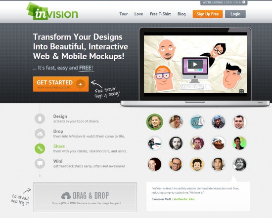
Developing designs for mobile and what to create a mockup? Try this hot new tool at http://www.invisionapp.com/
Testing Tools
Virtual testing tools that let you see what your website looks like on almost any phone on the planet (for a price) http://www.keynotedeviceanywhere.com/

Mobile Device Specifications
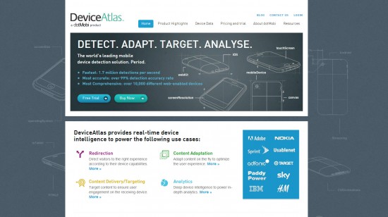
Want to know what features are supported by a particular phone? Look it up at https://deviceatlas.com/
Design with a Grid
The Folding Grid from Golden Grid System (GGS) divides your browser window into 18 columns. The GGS uses the leftmost and rightmost columns as outer margins for the grid, leaving 16 columns for your design. Those 16 columns can be combined, or folded, into 8 columns for tablet-sized screens, and into 4 columns for mobile-sized ones. This way GGS can easily cover any screen sizes from 240 up to 2560 pixels.

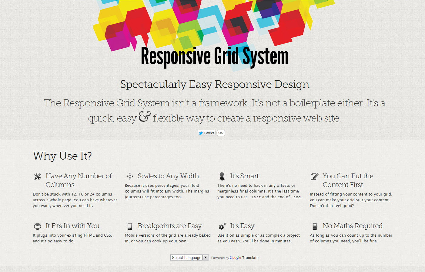
The Responsive Grid System, as the name implies, provides tools for creating responsive designs using a grid. No muss, no fuss, and no MATH required.
The Javascript Grid enables you to drag a grid across any web page.

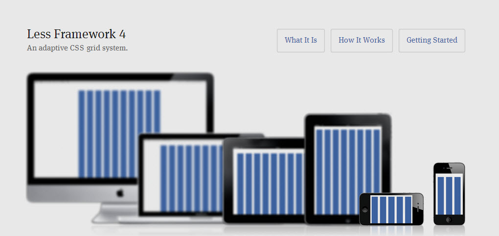
The Less Framework is a grid system that makes it easier to design responsive websites. Don’t be confused by the fact that Joni Korpi who developed the Less Framework, calls them adaptive websites. Many people use the terms adaptive and responsive interchangeably, and this tool can be useful for both design approaches. The Less Framework contains 4 layouts and 3 sets of typography presets, all based on a single grid.
Use Javascript for older web browsers
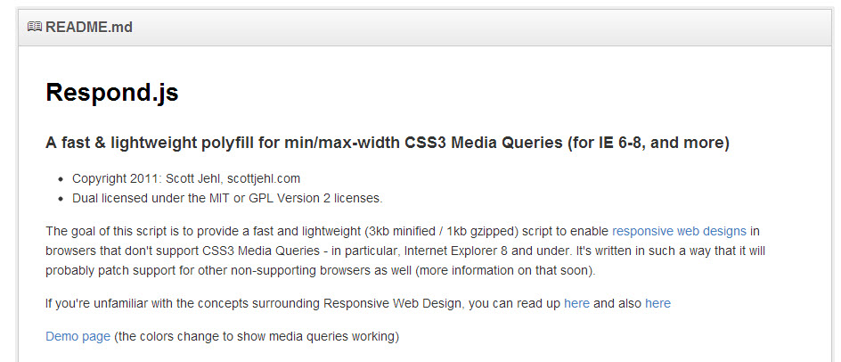
The Respond.js javascript was created to help make responsive web designs work on older browsers (even Internet Explorer 6.0!) This site makes it easy to download the javascript file and explains how to use respond.js.
Test your designs
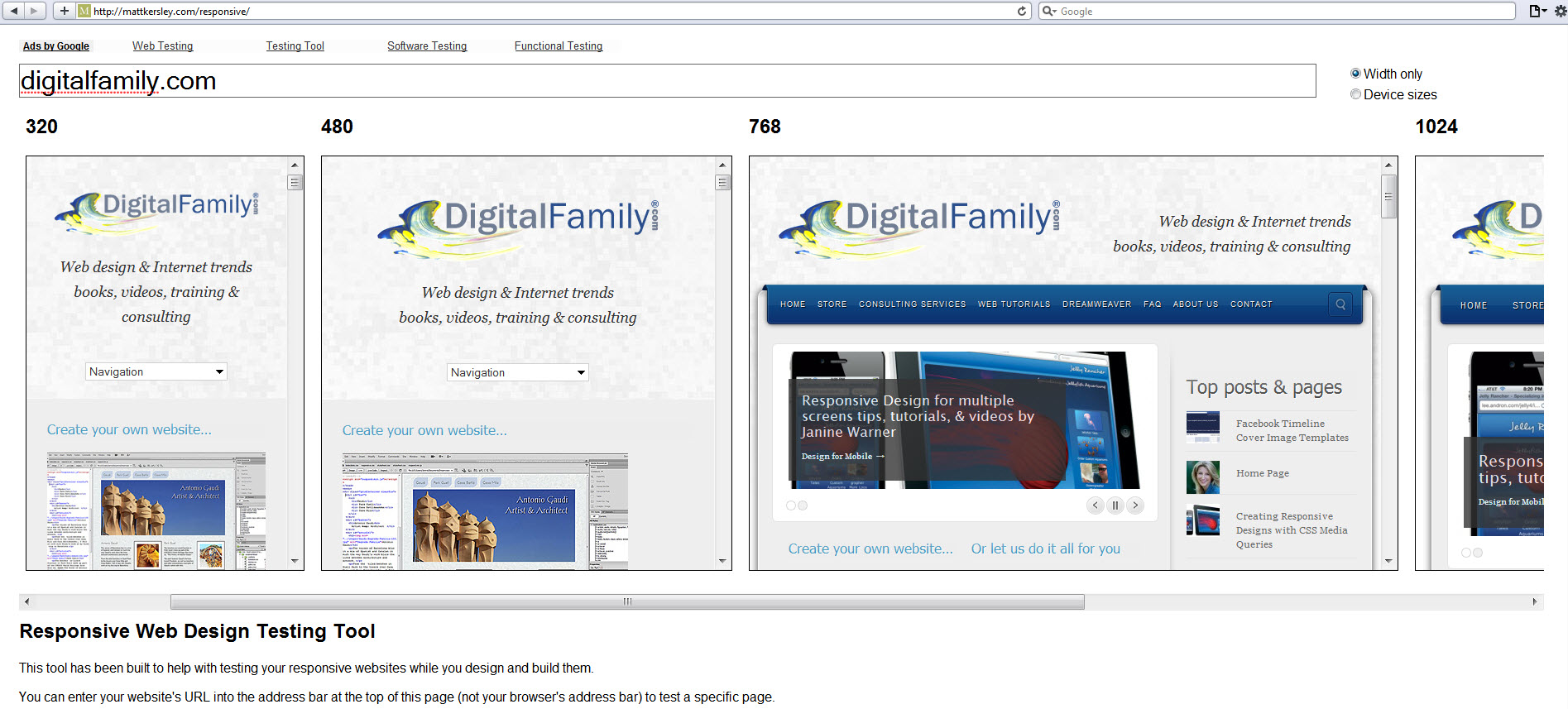
Discover how your web site looks in a wide range of standard browser sizes with Matt Kersley’s Responsive site testing tool.
Remember: This is a fast-growing list of resources, please share yours by adding a comment below, or sending me an email janine@DigitalFamily.com