 Many people use the terms Responsive Design and Adaptive Design interchangeably, but creating a distinction between them does help clarify two different approaches to the modern challenge of designing web pages that work on small and large screens.
In the world of web design, the only thing harder than keeping up with the ever-evolving standards in HTML, CSS, and other technologies, is keeping up with the vocabulary. This article is about helping you understand what responsive and adaptive design mean, and how these approaches differ.
Many approaches to mobile web design
When people first started using mobile phones to connect to websites, many of us created special versions of our sites specifically optimized to work only on small mobile devices. Today, some sites still use this approach, creating one simple mobile site for visitors with cell phones and directing everyone else to the main desktop website.
As mobile devices have become “smarter,” two new approaches to designing for small and large screens have become popular — adaptive and responsive design.
Adaptive design was developed to meet the diverse needs of a growing number of cell phones with different capabilities and screen sizes. Adaptive design requires that you create many different versions of each web page, and install complicated programming on your web server that detects each device and delivers a version of the site optimized for the specific size and features of that cell phone visitor. Adaptive design is complicated, expensive, and generally used only by large, well-financed websites.
Fortunately, a new, simpler approach called responsive design is quickly gaining popularity. With responsive design, you create one web page and then use multiple sets of CSS rules to change the format and layout based on the size of the browser window.
What Responsive and Adaptive web design have in common
First, what they have in common. Both responsive and adaptive web design are essentially about creating web designs that are optimized for the size of the screen or the type of device that is used to view them.
The basic concept is that you create a website that works on multiple screen sizes, most commonly to work well on at least three different screen sizes — a small mobile screen, a tablet-sized screen, and a larger desktop computer monitor.
Okay, so what’s the difference between responsive and adaptive web design?
The simplest and most common way I’ve seen these terms compared is:
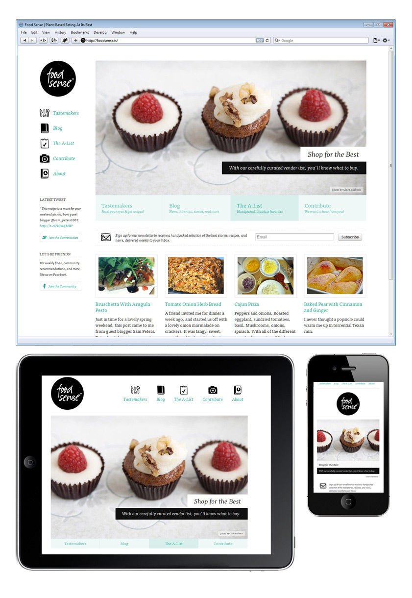
- Responsive designs respond to changes in width of a browser window by fluidly adjusting the placement of elements on a web page to best fit the available space. Thus, as you drag the side of a browser to make it larger or smaller, you’ll see the design change in real time. If you want to see how responsive design works, visit a site that uses responsive design, such as http://foodsense.is/, and if drag the side of the browser window to make it smaller and larger, you’ll see how responsive design works. Visit that site on an iPhone, iPad, or other similar sized device, and you will see the design that is targeted to fit that size device.
- Adaptive designs , such as the one American Airlines created at aa.com, use a sophisticated auto-detection script on the web server to identify each device that visits the site and then deliver the best version of the site, based on the size and capabilities of each device. As a result, the American Airlines site doesn’t change if you drag the browser while you view the site. However, if you visit the American site on different mobile devices, you’ll not only see different designs, you may even see different content because with adaptive design you can send completely different versions of your site to each device.
Why choose responsive design instead of adaptive design?

American Airlines is an example of Adaptive web design.
The simple answer is that adaptive design is a lot more complex, and expensive, but it’s the only way to reach the broadest mobile audience. That’s because responsive design using CSS media queries, a relatively recent technology that is not supported by real old or limited mobile phones.
If you’re working on a website like the one at American Airlines and you need to develop a highly interactive, secure site that works for everyone who might ever visit your site with any type of mobile device, then you have to create an adaptive design. Ideally, you also have a big team of developers and the budget to handle the complexity of such a site.
Most designers today are chooing responsive design. Not only because it’s cheaper and easier, but because it’s so much more efficient to create one design that adjusts to different screen sizes than to create many designs optimized for all the different phones that exist now, as well as all of the new phones and devices that will come out in the future.
We’re not designing for phones and laptops and desktop computers anymore. Websites are being displayed on giant television screens, and soon we’ll be surfing with Google’ new glasses (called Google Glass) and who knows what else…
But don’t you care about people with older mobile phones?
If you’re asking that question, I applaud your desire to reach the broadest audience. It’s unfortunate that responsive websites don’t work on really old or really limited mobile phones.
I definitely care, and if you’re working in emerging markets, including parts of Africa, Asia, or Latin America where smart phones are not as common, you should care — a lot. In that case, I recommend you create an adaptive website if you have the resources. If you can’t afford that option, consider designing one, very simple mobile-friendly site. You’ll have to limit the features, but at least it will be accessible to everyone in your audience.
For those of us who are designing websites for the United States, or other more developed markets where smart phones and tablets are common, responsive design is increasingly the preferred option — not only because so many people use high-end mobile devices, but because the few people who are still using old, really limited cell phones don’t spend much time surfing the web. Seriously, the traffic to websites with really old or limited cell phones in most developed countries is so small it’s just not worth worrying about for most designers.
In case you haven’t tried it, surfing the web when all you have is a tiny, two-color screen and a phone number keypad is not much fun so most people with such limited devices don’t bother.
The technical details of Responsive and Adaptive design
Responsive design uses CSS media queries to apply style rules based on screen size (learn more about creating responsive web designs).
Adaptive design requires a device detection script that runs on the web server, as well as multiple versions of the site, generally created dynamically by drawing content out of a database and displaying it through a number of templates, optimized for each device. In the case of adaptive designs, if you visit a website with a mobile device you may see a very different version of the site than if you visit the page with a desktop computer.
Best of both worlds: The Boston Globe is a great example of a site that is responsive, but also uses a little server-side programming to remove elements, such as large images and videos, when the pages are displayed on small screens and cell phones with limited features. You’ll find a well-written case study on how the responsive design for the Boston Globe was created at http://upstatement.com/blog/2012/01/how-to-approach-a-responsive-design/.
A little history and credit for Adaptive and Responsive Design
The term Responsive Design is generally credited to Ethan Marcote. You’ll find his original essay on responsive design here.
The term Adaptive Design has been around a lot longer, but some give credit for this term to Aaron Gustafson who wrote a book called Adaptive Design.
Another terms get tossed around when we talk about mobile design “Mobile First.”
Luke Wroblewski deserves credit for the term Mobile First, which means designing the mobile version of a site before you design the larger, desktop version (historically most sites were designed the other way around).
Learn more about Responsive / Adaptive Web Design
- Designing for multiple screens: How to create responsive web designs
- Creating a Responsive Design with the Fluid Grid Layout features in Dreamweaver CS6
- Get up to speed quickly with responsive design in Dreamweaver with Janine’s latest Dreamweaver video
Good, informative article that makes the distinction between an adaptive website and a responsive website easy to understand.
[…] What’s the difference between adaptive and responsive web design? […]
Prior to the widespread use of microprocessors, a computer that could fit on a desk was considered remarkably small. Early personal computers, like the IBM PC, were “desktop” machines, with a horizontally oriented computer case, usually intended to have the display screen placed on top to save space on the desktop. In modern usage the word “desktop” usually refers to tower cases that are in fact more often located on the floor under the desk than on a desk.`;
All the best to you
<http://www.caramoanpackage.com/caramoan-tour/
Thanks for the history lesson, Sherry, very interesting.
Quite informative and well written.
In an SEO perspective, responsive web design wins, period.
[…] design is door het opknippen een duurdere en meer arbeidsintensieve oplossing dan responsive. De dure adaptive benadering is vaak alleen toegankelijk voor grote bedrijven met veel […]
I’ve mixed them up – take a look at http://www.redaptive.co.uk
I am a beginner and I find responsive layout to code on Dreamweaver really hard but adaptive quite easy not sure why..
[…] What’s the difference between adaptive and responsive web design? by Janine Warner […]
[…] What's the difference between adaptive and responsive web design? – – Apr 11, 2013 … Adaptive design was developed to meet the diverse needs of a growing number of cell phones with different capabilities and screen sizes. […]