 Creating responsive designs is the best new thing in web design, and Adobe’s new Fluid Grid Layout system is a great place to start in Dreamweaver CS6.
The new Fluid Grid Layout option is available from the File menu, and it’s a new category in the New Document Window.
As you develop your designs, keep in mind that the key to creating a responsive web design is to position all of the divs and other elements in your HTML document in a way that will work in all three layouts. For example, in the mobile version, create a single-column layout, in the tablet, create a two-column layout, and in the desktop version, expand the design to three or more more columns.
Remember, in responsive design, the divs and other elements have to be positioned on the page in such a way that using only CSS, you can rearrange them to display best on each device category (phone, tablet, desktop). This approach requires some planning, and usually a bit of trial and error. However, your reward will be that you will get a consistent, efficient web page look & feel, that works on multiple devices.
Get Started: Follow these steps to create a simple, adaptable, web design using the Fluid Grid Layout features.
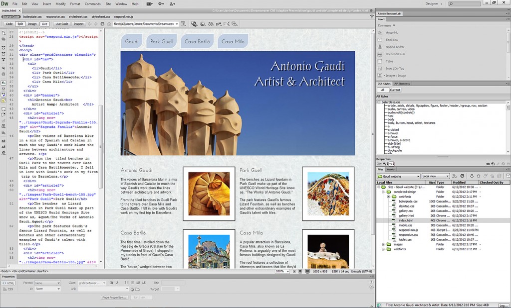
Step 1: Create a New Fluid Grid Layout
Choose File > New and the in the New Document Window, select the Fluid Grid Layout category. In this dialog, you can change the number of columns that make up the grid for each of the three target sizes, you can specify the percent of the column width that is used in each of the margins between columns, and you can specify the total percentage of the browser window that will be filled by the grid layout.
You can also use the DocType drop-down to select the version of HTML you want to use (usually HTML5, although there may be reasons you would use another standard).

Step 2: Save the “Boilerplate” and Other Style Sheets
When you click Create, Dreamweaver prompts you to first save a CSS file that includes the initial styles for the page. Simultaneously, Dreamweaver saves a boilerplate CSS style sheet, and a Javascript file, which are listed in the top of the workspace. Note that the HTML file that Dreamweaver generates is not saved in this initial step.

Step 3: Switch Between Mobile Size, Tablet Size, and Desktop Size Designs
At the bottom of the workspace, you can switch from one layout to the other, using three tiny icons which represent the mobile size, tablet size, and desktop size designs. When you change from one layout to another, the corresponding CSS is applied to the document displayed in Dreamweaver’s workspace. Remember, even though you’re only working on one HTML file, because Dreamweaver creates three sets of styles, you are able to rearrange and re-size the elements to create three different layouts.

Step 4: Change Window Sizes to Target Specific Devices
You can change the display size of any of the target devices by clicking on the Window Size arrow at the bottom of the workspace, and selecting a preset screen size. This comes in handy, if you are going to be targeting specific devices (a new iPhone5 has totally different screen size than an Android, for example). Window sizes can be edited in the Window Sizes category of the Preferences dialog – something that really comes in handy, because of the constant, ongoing evolution of mobile devices.

Step 5: Add and Insert Text and Images
You can add text and insert images into your pages as you would any other web page. However, if you really want to take advantage of the automated features in these fluid grid layouts, you should only add div tags by using the Insert Fluid Grid Layout Div tag.
The Insert Fluid Grid Layout Div tag option is available from the Layout Insert Panel. Also note, you cannot nest Layout Div tags in your Fluid Grid designs, and that all of your layout div tags need to be contained within the main div tag on the page, which is formatted with the a class style gridContainer. (Photos by iStockphoto.com)

Step 6: Add Fluid Grid Layout divs
As you add Fluid Grid Layout divs, you can resize them by clicking and dragging on the corners of each div. As you resize them, the divs will automatically snap to the closest grid line. Warning: If you view the corresponding styles that are automatically created in code view, you will see that the sizes are specified to the fourth decimal point, like this: width: 48.2758%. Resist the urge to round off these numbers. If you change these numbers in code view, Dreamweaver will no longer automatically adjust them for you.
Tip: When you resize a layout div by dragging from right to left, you make the div physically smaller. When you drag from left to right, you add margin space to the left side.

Step 7: Create Multi-Column Layouts
To create multiple columns, click on the small arrow to the right of any resized div. After a div is moved up, a new arrow appears in the bottom left that you can use to move it back down.

More tutorials about Responsive / Adaptive Web Design
- Get inspired with these great examples of Responsive design.
- Designing for multiple screens: How to create responsive / adaptive web designs
- What’s the difference between adaptive and responsive web design?
Step-by-Step Video Training with project files so you can follow along
Order Janine’s Dreamweaver CS6 training video and get the Antonio Gaudi website so you can follow along as you learn how to create your own responsive websites with Dreamweaver’s fluid grid layout features.
[…] How to Create Responsive Web Design with Dreamweaver CS6 Fluid Grid Layout? […]
Hi!,
What if the website being designed has totally different layouts for at least 3 pages. how would you use dreamweaver to continue building FGL for those pages as well as the page you started with, …will they share the same css file, how would you make it share when you start a new page?
[…] Fluid Grid Layout features in Dreamweaver CS6 – Creating responsive designs is the best new thing in web design, and Adobe’s new Fluid Grid Layout system is a great place to start in Dreamweaver CS6…. […]